


The world is changing everyday! Don’t miss the latest trends in Creativity, Marketing and Business! We will bring the whole world to you.

By: Vanessa Rodriguez Lang
A clear and concise guide on how to get the most from your branding design.
As much as effective branding design is an art, it’s also a clearly defined science. In fact, it’s a topic that has been thoroughly studied by countless researchers over the past several decades.
After all, when done right, branding design can have a dramatic impact on the way customers view a brand, whether or not they trust said brand, and in turn, its long-term growth and success.
We’ve created this guide to clue you in on some of the fundamental components of effective branding design to give you a head start into establishing your own successful branding.
Below we’ve outlined 11 fundamental components of branding design that will help you better understand what you should be looking for from your branding. This way, no matter who is doing your company’s branding design, you’ll have an expert opinion to provide feedback to your designer.
When it comes to setting a brand up for success, pure creativity is only a single piece of the puzzle.
Setting a baseline with competitor research before you get started is one of the most important things you can do to establish a solid branding design foundation.
Start by making a list of your top 10 competitors. A simple Google search will provide you with a list of your competitors. You’ll need to use accurate search queries to help refine this list, but you should be able to do that quite easily, seeing as how this is your company we’re talking about.
In fact, you probably can list 10 of your top competitors without the help of a search engine. What’s important is paying attention to what the market’s top competitors are doing right.
When you know what already exists in the market, you’ll be able to help your designer create something that is truly outstanding (as in “stands out”). The point isn’t to replicate what has already been done, but instead to understand what works and what doesn’t work.
This process also helps the creative brainstorming process.
Your research will help you to get a feel for the tone of the industry and see what has worked well for other brands, but at the same time, you’ll be able to design something that is totally new and unique.
Competitor research is a great way to get ideas in how brands are used throughout every medium and how these successful brands tell their story throughout different social media platforms, in ad creative, on their website, and within their company.
Get inspired by the cohesiveness of great brands and become aware of the weaknesses of the “less than great” brands.
In the digital age, we are designing for more mediums than ever. Print has always come with its own set of requirements, but now we need to make sure our designs work on web pages, online ads, and more.
Because of this multi-medium requirements, be sure that your branding uses fonts and layouts that translate to all of them. This means designing a brand that is adaptable, a brand with options.
How do you do this?
Think of all the places your brand will be used and start there. Don’t just create your brand with one layout. Design different layouts, a stand- mark, stand-alone typography.
For instance, if you are going to use your branding for Facebook ad campaigns, you must keep in mind the text size limitations that Facebook uses. In this case, a longer style logo or stand-alone mark would work better than let’s say a stacked logo. The layout allows for better use of ad space.
It is now more important than ever to adapt your brand to fit the mediums you are working with.
A lot of designers tend to get carried away when working on branding design. Adding more design elements doesn’t always make for better results. In many situations branding that is overdone can detract from the message you’re trying to get across.
That’s why your branding should try to convey as much as possible in a simple design.
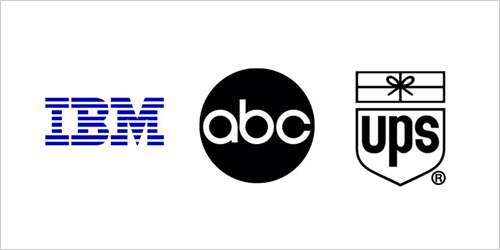
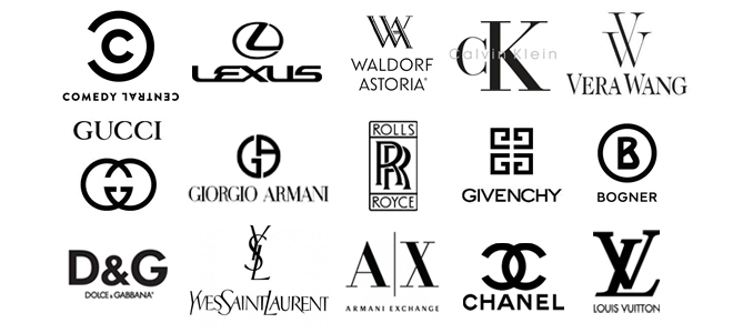
Branding doesn’t have to shout about the industry or the company. Branding design is often more effective when these things are subtly implied. The logos below are simple and to the point, and have been used successfully by these major brands for decades.
Time and time again we have worked with clients that have elaborate ideas of what they want their logo and branding to look like. More often than not those ideas would lead to some seriously over-the-top (and less than effective) branding design.
If you start off by coming up with some over-the-top ideas, that’s O.K.
The solution in these scenarios is to take that initial idea, simplify the concept, rework it based on your creative expertise, then you’ll likely work to deduct even more until you have created a simple, memorable brand.
The brand doesn’t have to say all that you want in just the logo, it can be conveyed throughout the use of your branding and tell a story as a whole and throughout various campaigns and usages.
Remember, your branding will evolve with your company.
Some of the best brands in the world have extremely simple marks that represent them. Take Starbucks, McDonald’s, Target, Android, FedEx, and Nike as examples of simplistic, effective branding design.
You can likely picture what at each these brands look like without needing any visual reference. This is because they are explicable, easy to recall, and have been built to prompt emotional reactions that trigger your memory.
While these examples are of large corporations (and you may not intend to establish your brand on such a massive scale), the principle of simplicity should be at the forefront of your new branding design.
Make sure you have a clear message in your logo and branding. You don’t have to say it all in your mark or logo, your story can be told and evolve through your marketing efforts.
Make sure the brand is easy to recall. This means it needs to be a smaller amount of information for the consumer’s brain to process, store, and want to reuse.
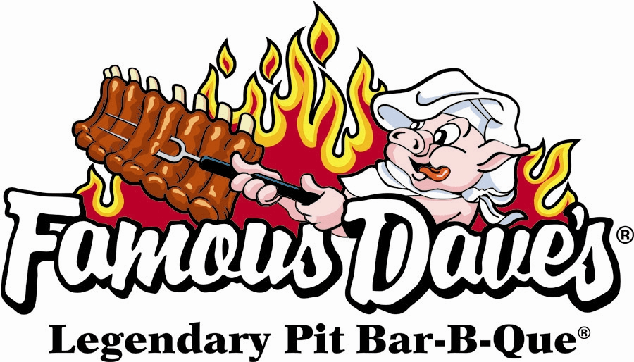
The logo below for the Epcot Food and Wine Festival has way too much going on. We get it guys, it’s a food and wine festival.

They could have easily gotten their brand message across without spelling out Epcot in food and drink paraphernalia. To top it off, they used two additional fonts to complete the name of the event. It’s just too much!
Another thing that tends to get in the way of effective branding design is when designers try to appeal to the client or the business owner (you).
For example, since the gym owner client really likes the color red and icon of an eagle, do they make the logo a red eagle?
Bad idea!
The MOST important thing to consider when designing your new branding is the company’s ideal buyer!
Who are they and what sort of brand will appeal to them?
This may be an extreme example, but there is no mistaking who the ideal buyer for this restaurant is. While it’s not ticking many of the boxes in the quality branding design checklist, it’s certain to get their ideal customers excited and makes a clear declaration about who they serve.
Once you understand this key element, you will have a clear picture of what direction your branding should go in. This step is so very important and will really determine your brand’s success.
So how do you find your Ideal Buyer?
Sophisticated designers use something called buyer personas.
A buyer persona is a semi-fictional representation of your ideal customer based on research and data about your existing customer. This document outlines a variety of specific information including:
Be as detailed as you can when creating your buyer persona, as you’ll be using it as a guideline for many of your branding design decisions.
More often than not, each company will have multiple ideal buyers. These personas can be completely different, so how do you create something that will work for all of them?
If your branding doesn’t resonate with the buyer, whether or not the client likes it doesn’t really matter. It just won’t be effective when it comes time to sell.
This may seem like common sense but we see problems with copycats all the time. When doing brand research it’s fine to gather inspiration from the competition. However, it’s important that that inspiration doesn’t cross the line into plagiarism.
A big part of effective branding design is the ability to set your brand apart. Your branding must be unlike anyone else in your direct industry, and really it should be unlike any other brands in any industry.
Take the time to identify the components of your competitors’ designs that inspire you and list them individually so that they can be compiled and allow your company’s unique personality to shine!
While standing out is imperative to your success, it also vital that your branding be creative and memorable.
If a consumer were to see your brand while driving by at 60 miles an hour, would they be able to interpret what they saw as your brand? Or would they pass by and have no idea it was there?
Unique designs that are simple and clean have a much better chance of being recognized and understood at a glance.
Say all that you need to say with each type of branding!
Create a logo that works as a stand-alone icon AND with your typography. We often see icons that don’t really fit together with the typography and vice versa.
The ability to use a stand-alone icon in branding really helps to make the brand look professional. We love creative icons that can be used as a standalone mark, but they have to be able to be combined with your typography too.
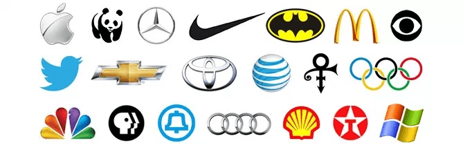
In fact, you should be able to use your typography by itself. All of the brands below are recognizable by their icons, yes, but you’d be hard-pressed to find someone who didn’t immediately recognize their typography when used alone.
Good branding design allows brands to use either part alone while presenting the opportunity to combine them effectively as well.
A great looking logo won’t cut it in the design world these days. Your branding design needs to communicate the brand’s message clearly and really resonate with your ideal buyer. Sure, it may be easier said than done, but it’s an important part of effective branding.
Remember that your brand is way more than just a logo; it is everything that represents your company. It’s developed from a story about your company and what it stands for—colors, marks, logos, typography, slogan, and so much more.
Messaging goes deeper than just your mark. Your brand story/message should be conveyed throughout each creative action you take, whether it be an ad campaign or a new website design. In short, while your brand message may not be iconically obvious in your logo or mark, it should be told on so many levels and understood by your ideal buyer.
An easy start to defining your brand message is to identify your core values! This is the meaning and the purpose behind your brand. Take a good look at what makes your brand unique and start there.
The other key component here is telling your story. Because of the obsession with technology today, your audience is more than available to listen and on multiple platforms…you just have to figure out what your brand’s story is and how to tell it through your visual identity and about your products or services.
Since your company is constantly evolving and so are the buyers, don’t feel like your story and messaging always needs to stay the same. Let it evolve with your brand and in fact, anticipate that so that you are always aligned with your market.
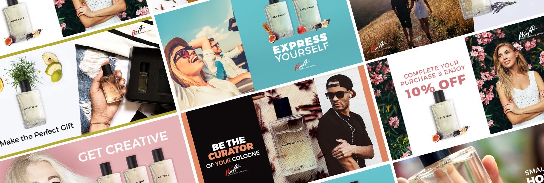
Another important aspect many brands and designers miss is developing a cohesive brand across the board.
Every aspect of your branding should work together to tell a piece of the same story. While it doesn’t all have to look exactly the same, it should fit together like pieces of a creative puzzle to form a complete picture.
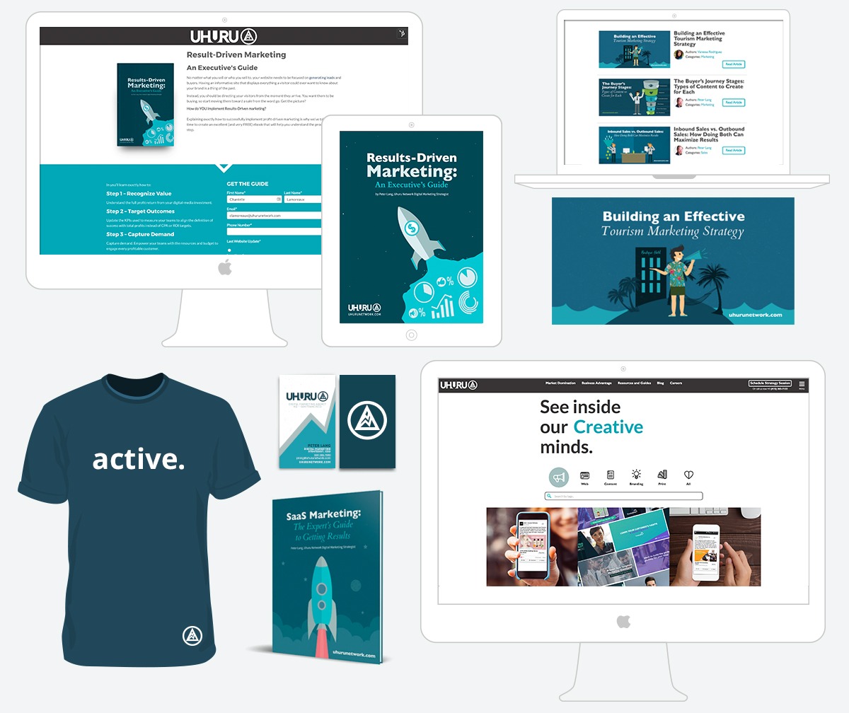
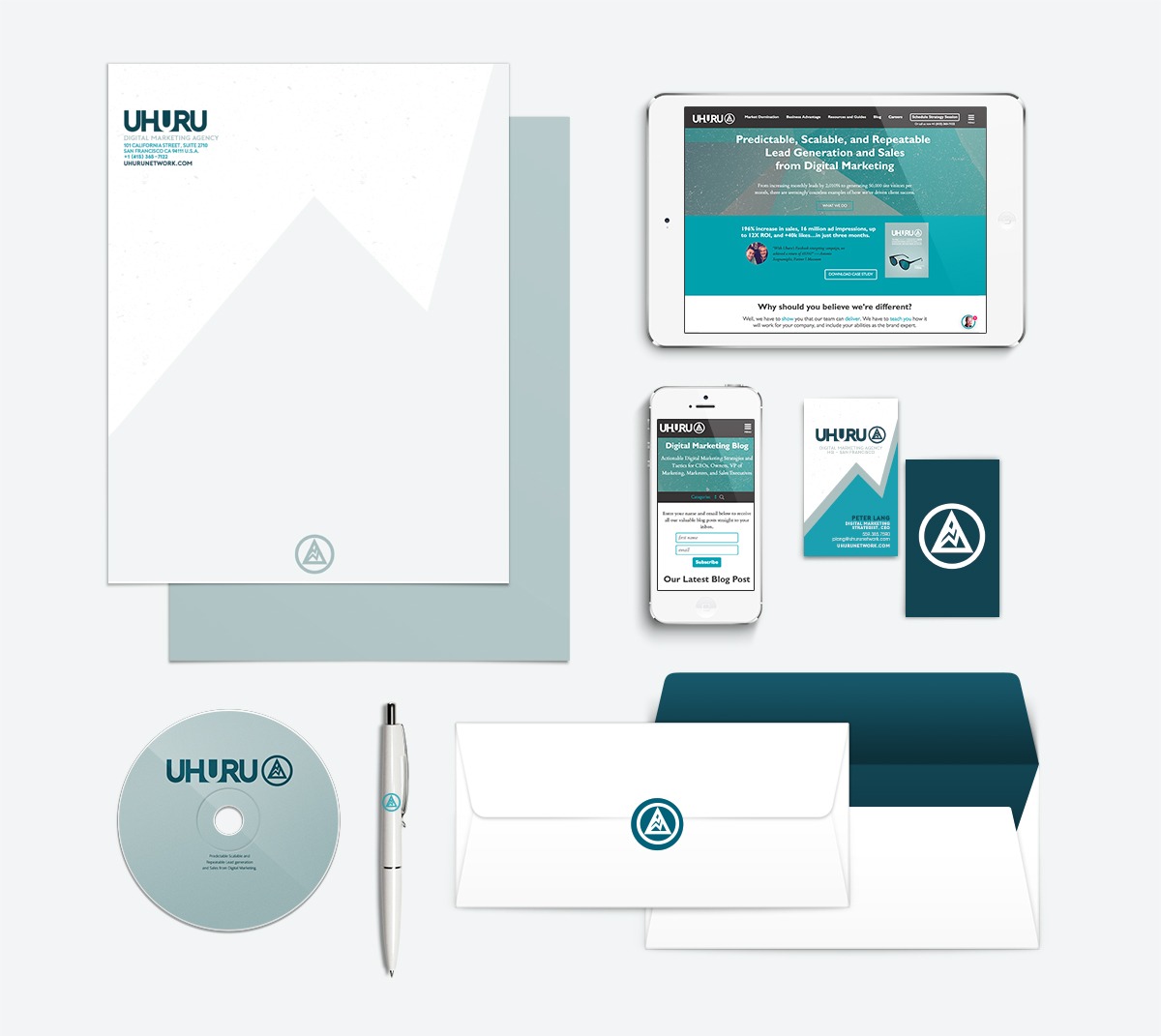
Above, our company displays the perfect example of cohesive branding that tells the story of our brand.
Each of the print items is slightly different, but they adhere to a coherent theme that helps our customers feel like everything is connected. This trend is followed by our web design and digital branding as well. How do you keep it cohesive? Here are 5 rules to live by:
1. Color Palettes:
Make sure you establish a primary color and secondary color palette. This allows for your brand to be used as you originally intended it and opens up design opportunities for creativity with different mediums and future campaigns. Both palettes should be listed in CMYK, RGB, and Pantone.
2. Fonts:
Purchase and or download the fonts for your company. If there are different fonts for web and print it is important to define that.
3. Illustrations:
All illustrations should be in the same style. If you start with a pen-illustrated set of icons on your website, all illustrations should have similar pen-illustrated characteristics.
4. Imagery:
Professional brands set the tone for their photography by doing a brand shoot. This shoot would then be emulated with all future photography used throughout the branding.
5. Brand Guidelines:
Take #1-4 + more and put it in a pretty little book called Brand Guidelines. This is your FOOLPROOF PLAN for COHESIVENESS! (I talk more about this in the next section.)
From website to Instagram ads to printed brochures, cohesiveness is going to really create a sense of familiarity and trust with your ideal buyers!
A great way to keep your branding design cohesive is to establish structured brand guidelines.
Good branding should have hard-set rules about how it should be used and what kinds of manipulations should be avoided.
Clients will inevitably pass work to in-house employees or other creatives. This is especially true in larger organizations when multiple departments will be working with the branding you create.
As such, having a clear guideline of what can and cannot be done with the original branding will go a long way in keeping the original branding design intact.
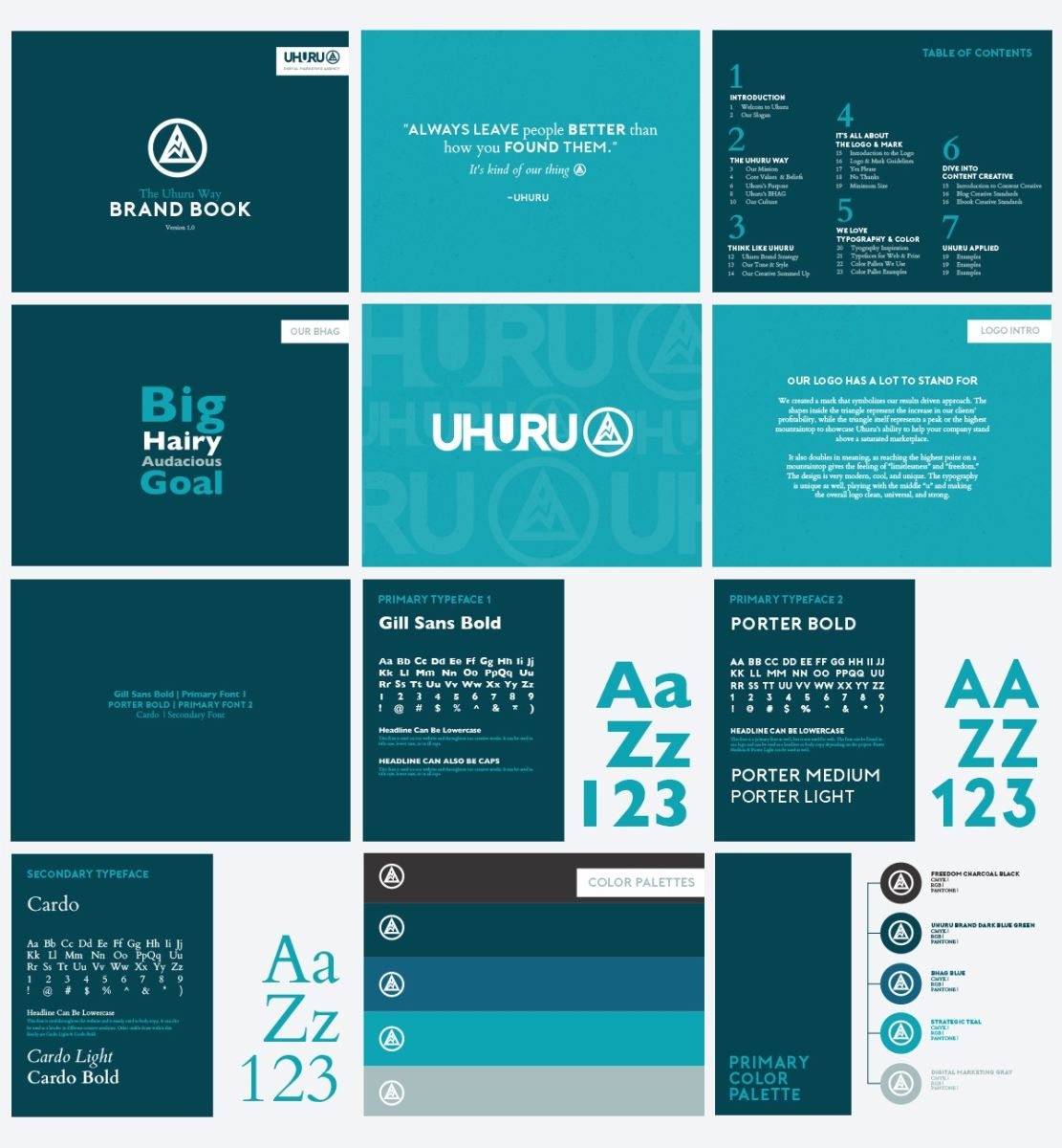
Your brand guidelines (like the one above) should include things like:
You’ll put a lot of time, energy, research, and talent into establishing your branding. Setting clear brand guidelines allows you to dictate exactly how your branding should be used most effectively and keeps things cohesive, no matter who is working with your brand. If they see your brand guidelines, they now understand your brand and know what to do/what not to do with it.
One of the industry rules/recommendations is to rebrand every 5 years. It keeps branding relevant and inline with the company’s current standing.
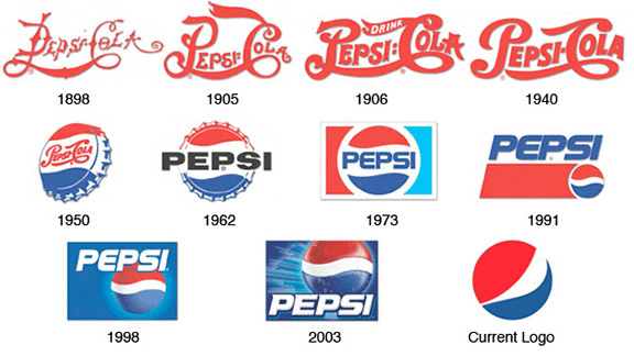
However, we find that many companies are resistant to rebrand this often. What’s worse is that newer brands or those that are growing fast may be hesitant to rebrand even when their business is changing so quickly.
Your branding design should portray your brand’s current message and values to your buyers. If things change, be ready to rebrand so that your creative remains relevant.
We already talked about designing to stand out. While standing out from your competition is important, it’s also important to stand out visually.
You should work to create eye-catching branding that gets people to stop scrolling through news feeds or to pay attention when your video ad plays.
The way consumers interact with brands online has changed. People move faster than ever and attention spans are shorter than ever. Test your branding with the scroll test.
Does it make you want to stop scrolling across your desktop news feed? How about mobile? If your branding just blends in with the rest of the noise, consider adding a design element that will help capture the attention of online users.
You’re now far better prepared to approach your branding or rebranding project. The principles of effective branding design outlined above give you the insights to determine exactly what you need from your new branding and what you should expect from your designer/team.
Work to implement as many of these guidelines into your branding as possible and you’ll find your end result to be more appealing to your ideal buyer and more effective toward achieving your overall business goals.
The world is changing everyday! Don’t miss the latest trends in Creativity, Marketing and Business! We will bring the whole world to you.
CONTACTS
622 Emporium Tower, 21st Floor, Sukhumvit Rd. Klongton Klongtoey Bangkok 10110
+6626648882
FOLLOW US