The world is changing everyday! Don’t miss the latest trends in Creativity, Marketing and Business! We will bring the whole world to you.
Animations are cool. That is a well-documented fact, not opinion (trust us). Remember back in the late 90s when GIFs and early animations proliferated? How long has it been since you thought about the Hamster Dance or Peanut Butter Jelly Time. Those early viral animations are the predecessors for the stunning, refined animations we see today.
Web animation is any motion that is on the web, and though Flash is not used as much now, there are many techniques and technologies that bring the Internet to life:
Animation isn’t just about entertainment or cool logos anymore. Today, animations can be used in a variety of ways and many companies are finding subtle, yet impactful uses on their websites. They aim to draw the eye exactly where it needs to go. But when used wrong, they can also draw attention away.
To make the most out of animations, give them a purpose, says Joe Jordan, creative director at JK Design. Make them meaningful.
Using animations is almost a no-brainer. Research found that users stay on a webpage 2.6 times longer than normal when it has animation.
People like interactive graphical elements. This is attributed to the average human attention span of eight-seconds (according to a 2015 study by Microsoft Corp). Videos and animations keep people engaged, keep the eye moving and may even be used to draw viewers to the CTA. Research by the Online Publishers Association showed that over an eight-month period, 80 percent of users had watched a video ad, and of those, 46 percent had taken a follow-up action.
The best thing about animations is that they can fit seamlessly into your brand — they can be subtle or overt.
For example, many companies have found success with explainer videos directly on their home page. Creating an attention-grabbing starting screen that makes users want to press play is a sure way to keep them on the page long enough for you to tell them why they should buy in.
Subtle animations, like the little bounce of a login button that tells the user they’ve input their information incorrectly, provide a better user experience. On the other hand, there are more overt options, like a character that stays with the page as users scroll down so the user can connect with the brand’s personality.
Regardless of how they are used, webpage animations are a matter of UX design. When a user lands on your website, it may be their first impression of you, so you want their experience to be the best it can be. You want them to be engaged with what they are seeing and how they are experiencing your page. And you want to ensure their attention is held long enough to sell to them.
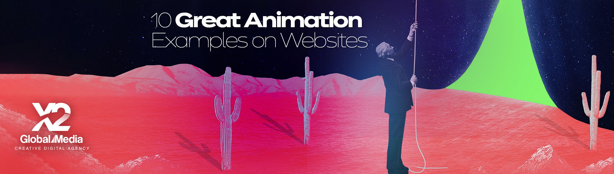
Needing inspiration for your web animations? Check out 10 great examples of animations we found. Some are big and bold. Some are understated. But all of them have considered brand identity, their target audience and how users will interact with the page.
1. Marie Weber

Upon hitting enter on the address bar to go to this page, you are greeted with a simple, elegant animation of the handmade shoe company’s logo. In fact, on every page on the website, this same animation greets you. It matches the luxuriousness of the brand and gives a bit of that je ne sais quoi—an unmatchable indication that what you’re waiting for is worth it.
As you move through the site, other elements are animated too. Like the entrance of shoe collection names, shoe images that appear before zooming out and small lines under the links that show up and animate under the name so that it’s clear which link you’re about to click on.
2. Wonderful Weekends Festival

The Wonderful Weekends Festival page is a veritable delight of animations. The landing page is all about moving pieces, but they didn’t stop there. When the page first appears, a small box pops up to tell you when the festival is visiting and offers you two choices: Play Now or Show Me the Festival. This is where it’s all in the details. When you hover over those buttons, they flash Google’s colors (the festival’s sponsor).
Those buttons aren’t the only place Google’s brand shines. When you’re going through the pages, active links also flash with the colors, and each new page starts with an animation of the brand colors. Want an animated delight? Try out the links to Weekends Helper and Tips & Tricks for a lesson in audience engagement.
3. Waze
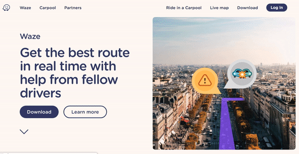
At first glance, you might not understand why we chose Waze. After all, the page quickly animates in, but it’s not spectacularly dynamic. Instead, it is the subtle animation that we found impactful — the little bouncing arrow at the bottom of the page. That arrow is innocuous. It is unassuming. It is a simple, user-friendly feature that politely tells you what to do next: Click it.
The arrow captures your attention and leads you to more information. This type of simplicity is a perfect example of how small animations can make a big impact.
4. Coca-Cola US
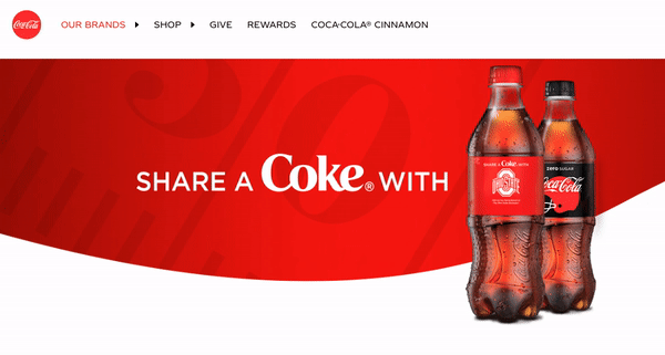
Coca-Cola’s page is primarily static. You may expect animated bubbles in line with their “refreshing” brand strategy, but no. Instead, they’ve used an animation for another ideology that has been incredibly popular since 2014. “Share a Coke” takes center stage here and the animation only enhances this brand strategy. One Coke bottle’s label moves between various names — both female and male names - and teams.
In addition to enhancing their current marketing drive, the rolling animation offers Coke the chance to make seasonal updates. Currently, the team names are for football, both collegiate and professional, which appeal to an American audience glued to the popular Autumn sport. You see a familiar name, your favorite sports team and you can’t help but want to go get that Coke.
5. Google

Google’s Your Plan, Your Planet site is aimed at helping people think about conservation and green living and how they can actually make the change. The landing page is simple. Text moves in, but then remains static. But once you click through “Let’s Get Started,” the page wakes up with four adorable animated icons that lead to even more dynamic animations.
Whether you click on the waving teddy bear, the dripping faucet, the lighting light bulb or the fridge with the swinging door, you’ll find a schema that tells you to find out more about how to conserve in that section. It stays interesting on a subject people sometimes just tune out, which is exactly how animations should be used.
6. Pete Nottage

This website for voice actor/presenter Pete Nottage is one of the best on the web for animations. When you first load the site, the Pete Nottage logo appears with a little red swipe across it—a sure hint that the brand is about bringing color to what was once dull. Then a sea emerges, followed by a small cityscape. Cars drive around the city, boats sail around the sea, planes fly through the air and each building has a special animation when you click on it.
Clicking on the links also provides little nuggets of personality through animations. On his “About” page, a headshot illustration animates in, and if you click on it, it leaves, only to be replaced by another version of the animation. It’s these types of touches that show who Pete Nottage is and why someone would want to hire him.
7. Zamzar
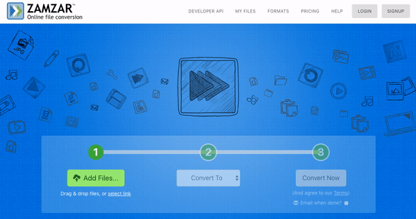
The approach by Zamzar is subtle and simple. You need to convert a file and there are only three easy steps to do it. Zamzar makes this clear with a blinking glow around the number one for the first step. Once you complete it, the bar fills up to step two and it begins the blinking glow.
For a company that says boldly, “File conversion made easy,” this straightforward animation is an excellent iteration of their brand’s motto.
8. Blizzard: Warcraft III Reforged
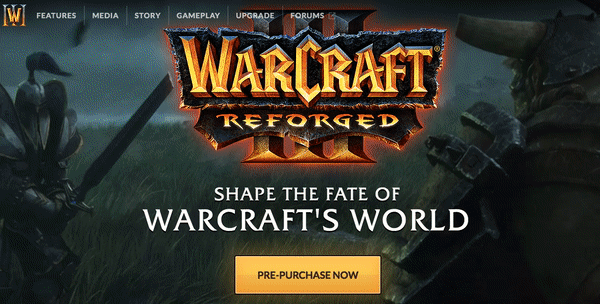
What’s the best part of Warcraft? The cutscenes. Oh sure, there are other things to love, but the outstanding graphics and furtherance of the storyline during the cutscenes was worth the play time. Perhaps this all seems off subject, but when you click through to the Warcraft III Reforged website, you’ll see why it matters.
Playing in the background of the page are both cutscenes and gameplay experiences. Overlaid on the animation is the title of the game and their pitch, but it’s what’s behind it that is carefully placed to enhance nostalgia (Warcraft III was the best of their games; change my mind). It reminds players what they used to love and shows off a bit of the enhanced graphics of the rereleased game.
9. Piktochart
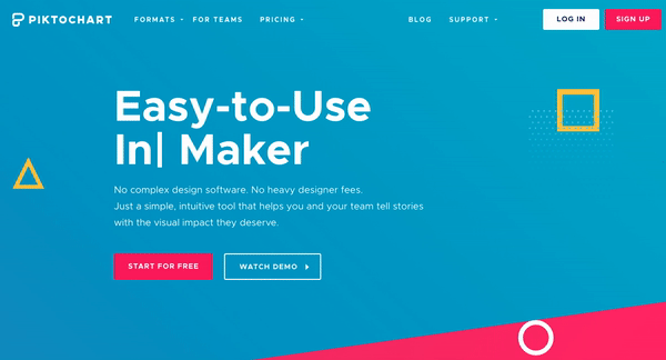
What can you do with Piktochart? The animation on their page will tell you. Animated typing writes a word under “Easy to Use” in front of “Maker.” Words like “Infographic,” “Social Graphic,” “Presentation” and “Print” all appear and are erased to make room for the next word.
With this animation, Piktochart states their claim quickly, shows users what they will get from the website and maintains their quirky, visual brand.
10. Cisco
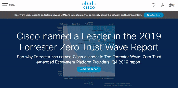
Cisco is an American conglomerate whose work in networking and telecommunications has made them a multi-billion dollar company. The significance of the business, and the associated corporate feel, are reflected on the page, which focuses on learning more about the business and company updates.
It would be off-brand for Cisco to introduce an illustrated animation or one that draws your attention to one place or another. Nevertheless, they know that animations help, which is why they’ve added just a few minor ones that make big impacts. Put your mouse pointer over one of the first three images on the page, and the other two slide over so you can see more about that link. The icons below those links enlarge when moused over so that you know which one you’re about to click on. Deliberate and engaging, just like Cisco.
Whether you want to go bold with your animations or take the subtle route, just remember that they must fit seamlessly within your brand. If your brand is elegant and luxurious, you may want to take a note from Marie Weber. If your bold, fun or exciting, perhaps the Wonderful Weekends or Pete Nottage websites will inspire you. Or if you’re looking for simple or corporate, Cisco or Zamzar’s modest animations may be right for you.
And, if you’re looking for something truly entertaining, consider a fun landing page like this one from our team at Superside.
The world is changing everyday! Don’t miss the latest trends in Creativity, Marketing and Business! We will bring the whole world to you.
CONTACTS
622 Emporium Tower, 21st Floor, Sukhumvit Rd. Klongton Klongtoey Bangkok 10110
+6626648882
FOLLOW US