The world is changing everyday! Don’t miss the latest trends in Creativity, Marketing and Business! We will bring the whole world to you.
The significance of a brands Logo has been there since the inception of the concept of branding. With the rise in digital marketing, logos have become all the more important by becoming the brand’s visual representation. Logo design trends keep changing with time, and we have seen many graphic design techniques used for logo creations. Unfortunately, many trends become irrelevant after a while and are taken over by other trends.
Because Logo designing is an integral part of graphic designing, many trends of graphic designing trickle down to logo designing, designers need to keep themselves updated about these trends to use them wherever needed. The normal viewers may not be able to categorically identify such logo design trends, but they would certainly find a logo out of place if it is not as per the latest trends. This blog collates some of the major logo design trends that we will see in 2022.
1. Less will Now be More
Minimalism is a trend that has taken the graphic design industry by storm. In all the streams of graphic design, you will see designers trying to cut the clutter and produce crisp and effective designs. Minimalistic logos have been in trend for a few years now, but 2022 will see more and more brands adopt this approach.
In logo designing, minimalism has its advantages and disadvantages. Through its logo, the brand wants to convey many things like its values, services it offers, or the customer base it caters to. Therefore, the minimalism logo may not be able to cover too much. On the other hand, minimalistic logos are easy to apply in any design form. They also have a better brand recall amongst people as they are easy to remember. Therefore, we will see a fine blend of smart and minimal logos in the coming year.
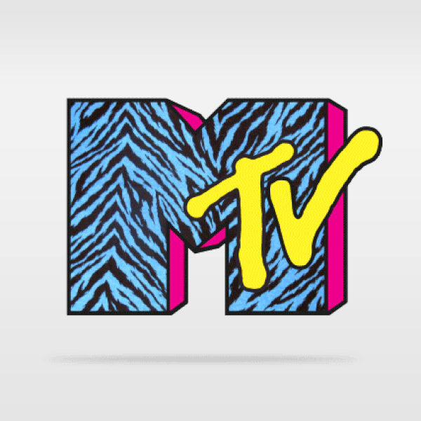
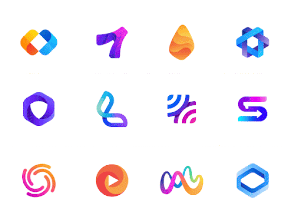
2. Use of Multiple Vivid Colors
All designers must understand and implement the science of colors. Each color has its significance and should be used accordingly. In addition, the use of colors has its trend. There was a time when flat, dull colors were in trend, and in the last few years, we saw pastel colors being used more. In 2022 we will see designers using more bright and vivid colors, especially logos.
The use of vivid colors makes the logo look more dynamic and catchy. It also helps the logo stand out amidst the other designs. The bright colors instill a positive and vibrant emotion in the viewer. You can use vivid colors either in the parts of the logo you want to highlight or throughout the logo, provided the elements are not big.
3. Opting for Tall Logos
There have been many different schools of thought about the ideal composition of a logo. The truth is that there is no ideal composition. It would depend on your brand, logo usage, and design preference. The digital world has pushed for more rectangle-based logos as they are easy to set up on websites or other platforms.
However, the rise in the concept of variable and responsive logo usage has made it possible for designers to expand their creative bandwidth and produce logos in various compositions. Therefore, in 2022, we will see more brands choosing tall logos. This style offers them more options in the addition of design elements and typography. Also, vertical logos fit better in most digital designs, be it social media posts or other digital marketing-related assets. Hence, tall logos are a good option if you are looking to draw attention to your brand and market it in the best possible way.
4. Making the Right Use of Negative Space
The concept of using negative space for logo design is not new. We have seen many marque brands like FedEx, NBC, and more using this concept. Making the right use of negative space makes the logo look smart and offers more brand recall. Going smart is a key trend in logo designing in 2022; we will see many brands choose the negative space concept for logo design.
Ambiguity is always helpful in getting people’s attention. This is where negative space logos are very useful. Also, these types of logos are simple in design and look smarter and more meaningful. Although as a designer, you need to make sure that negative space is not forced, and you can convey the right message.
5. Retro Effect will Return
If there is one trend that graphic designers keep bringing back, then it is the retro effect design. While retro designs had their glory a few decades back, designers still want to fall back to them. This is more related to market science rather than visual design. By using the retro effect, designers can generate the sentiment of nostalgia among viewers and thereby connect with them.
This is why Burger King has made their logo retro to remind people that they have been in the industry for decades. In 2022, we will see more and more brands, especially those rebranding themselves, choose this trend. As a result, we will see more vibrant colors, big typographies, and an overall feel-good factor in the logo design from a design perspective.
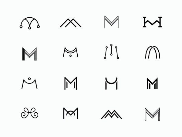
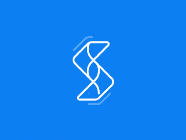
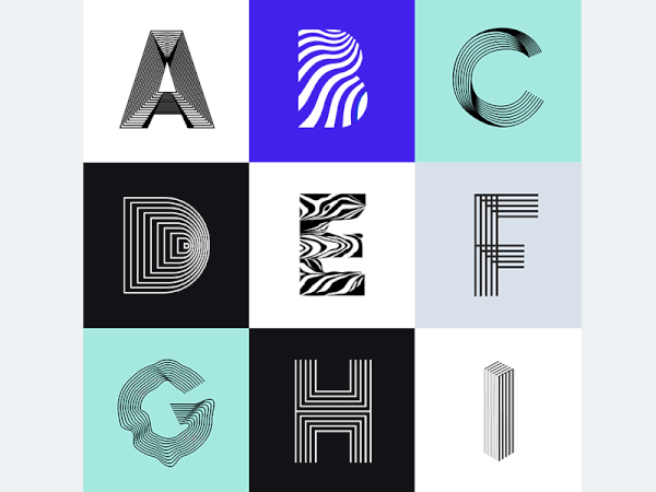
6. Line Outline Minimal Logos
The minimal design trend will be taking another spin-off in 2022 as we will see designers create line art-based logos. The designs will be kept minimal and simple, but at the same time, the right message of the brand will be conveyed effectively. Like minimal and negative space logos, these line outline logos are also not easy to create as there is limited design scope.
Given their simplicity, outline logos look visually appealing, and the good part is that they do not overwhelm the other design elements when used. The key to a good outline logo is to not overdo it. Designers generally go for a simple or creative icon related to the brand. Because they are light and subtle, they are easy to animate and look elegant whenever used in designs.
7. Using Optical Illusions
In the logo design trend of creating “smart designs,” 2022 will also witness brands showcasing logos with optical illusions hidden in them. The excess of digital marketing has resulted in the saturation of visual designs. Amidst all this digital noise, your brand’s visual identity must stand out, and hence you will have to do something different for it. Using optical illusions is a way to grab and retain people’s attention.
While many common illusions are being deployed, you can explore 3D and geometric shape illusions. A good tip to designers using this type of logo is to ensure that you do not go overboard with the illusion. Then, you can show it to a few people and get their feedback because using the illusion that people do not understand will make your logo stupid and not smart.
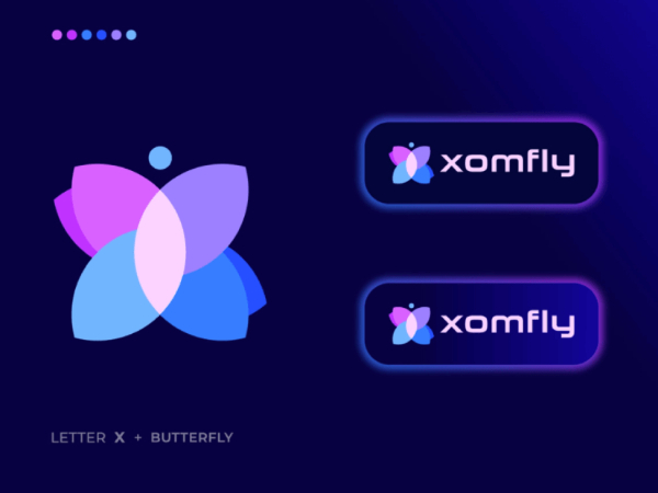
8. Setting up Layers on Top of Layers
This logo design trend is a fine combination of using vivid colors and keeping the logo simple. Many major brands have redesigned their logo to contain overlapping shapes of different colors. This makes it easy for designers to explain their logo concept and allows them the creative bandwidth to use a variety of colors and shapes.
This type of overlapping can be applied to almost any shape, letter, word, or even symbol. For example, when two colors overlap, they result in the formation of a third distinct color. This concept makes the logo look ingenious, creative and provides more brand recall. Also, more colors and shapes make the logo look vibrant and voluminous. This allows designers to create different brand elements out of the logo.

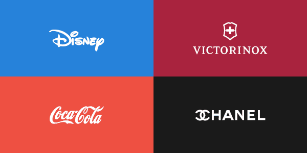
9. Using Small Serif or Lower Lettering Logos
For ages, the unspoken norm in logo designing has been using uppercase letters when it comes to writing the brand name. The basic reason was to ensure that the brand name stood out visually. However, in 2022 we will witness a radical change where brand logos will have their names in lowercase. This will look quite modern, but designers will have to use heavy fonts to easily read the names.
Just like the use of lowercase names, we will see in 2022 the use of simple serif wordmark logos. Brands want to further simplify their visual presence and drop any visual imagery. This will be replaced by the brand name written in a nice elegant serif font. This trend will be seen more in premium luxury brands whose branding relies on its name.
10. Using Gradients for Showing Depth
Gradients always make your design look lively. This is why, for the last few years, we have seen the use of fluid gradients as one of the top design trends. However, when it comes to logo designing, gradients can be used to indicate depth when used in the right manner. This way, designers can use a gradient to create a more three-dimensional effect on the logo.
There was a time when using gradients in logos was considered a bad idea. This is because printing gradients is a difficult task. But now that logos are used as visual identity predominantly in the digital media, it has become a lot easier for adding gradients to the logo. Gradients also allow designers to add multiple colors, which can be used later on for other branding assets.
11. Mascot in the Logo
Mascots and logos are like the chicken and egg analogy; we will never know which is responsible for what. Generally, elements used in the logo are then reused for developing other branding assets, including the mascot. Twitter is a good example of this as the logo itself is then used across platforms for branding.
Mascots, just like logos, are an extension of your brand’s visual identity and help ensure a better brand recall. In 2022, we will see more mascot or character-based logos, especially for the brands that directly connect with the customers. Not being too serious is the millennial trend, resulting in many brands directed to them taking the mascot-based logo approach. Many such brands have already started adopting cartoon-based logos.
12. Variable and Responsive Logos
What started as a design trend has now become a design necessity. This has been the case with responsive logos. Brands started to use different versions of their logos based on the application medium. If it’s on a website, they use a horizontal version of the logo, and if it’s for digital marketing, they like to use a square version of the logo. In 2022, this concept of using responsive logos will become a routine practice.
The concept of variable logos seems to be an output of an enthusiastic marketing team. Ideally, you will not want to tamper with your logo. However, many brands keep changing certain logo elements to depict different identities. The base logo remains the same; only the elements or taglines change. Variable logos are used by big corporations that have many sub-brands under them. In 2022, we will see more and more business conglomerates adopt this logo designing concept.
Conclusion:
Logo design trends change quite frequently. As a designer, you need to keep yourself updated about these trends. Whenever you take up a logo design project, you should refer to these trends. Along with that, you should also check the market trends for your particular brand. Based on the design knowledge you’ve gathered and the creative brief you’ve developed, you should begin your logo designing project.
The world is changing everyday! Don’t miss the latest trends in Creativity, Marketing and Business! We will bring the whole world to you.
CONTACTS
622 Emporium Tower, 21st Floor, Sukhumvit Rd. Klongton Klongtoey Bangkok 10110
+6626648882
FOLLOW US