The world is changing everyday! Don’t miss the latest trends in Creativity, Marketing and Business! We will bring the whole world to you.
BY BILL GARDNER
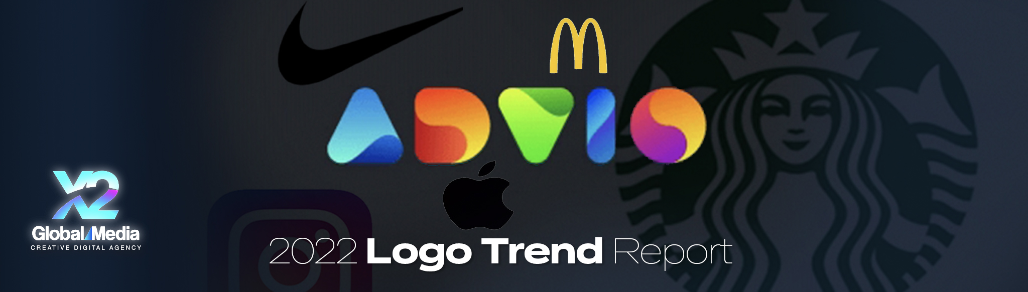
The 20th Annual Logo Trend Report presented by LogoLounge is full of all the good, the badass, and the ugly.
I was recently asked to reflect back on the past 20 years of the LogoLounge Trend Report. How has it shaped the way I design? What has the impact been on me personally? What came to mind was a phrase I often use, but that others seldom understand: “It’s more important to know how you got there than to know where you are.”
Clearly, it IS important to know where you are. I’m not suggesting everyone wander around lost (although that’s sometimes a necessary part of the creative process). What I am saying is that two decades and 380,000 logos later, it’s still just as important as ever to do. the. work. A great logo transcends the trends. And I’m talking about the core definition, the Latin roots: trans (across) + scandere (climb).
As trends build momentum, swing from one extreme to the other, they leave a mark. A tangible foothold. A place to grab onto and navigate as you climb. And when you reach the summit, the beautiful views of a place where you’ve nailed the design, it’s breathtaking. When I look at a logo, I know when a designer came up with it because they did the research and foundation work–and when someone just copied something they thought was cool.
SO WHY EVEN GATHER ALL OF THESE LOGOS into one collective if pure imitation is something we dissuade? Because context is core to meaning. The best ideas never come “out of thin air.” It’s not possible for a thought to enter your mind without being preceded by another thought. And one before that. (Unless they’ve invented some new psychedelic I’m unaware of.)
We’ve never had so much information yet so little context. It’s not hard to jump online and summon a certain logo or a specific designer or topic you have in mind. But what you’re “fed” (that’s why they call it a feed, you know), is more than likely in a closed loop of things you’re already familiar with. And conversely, when you try to intentionally jump out of your bubble you find yourself swimming in such a random pool that you could drown just filtering it down to anything that resonates.
The LogoLounge Trend Report opens our minds to possibilities that are relevant, real, and grounded in our collective psyche.
The reason the LogoLounge Trend Report has become so valuable to the design community is that it opens our minds to possibilities that are relevant, real, and grounded in our collective psyche. It is the place where that sea of content has been filtered down and given context. Savvy designers have a voracious appetite to see what’s influencing our field and this report has become their pilgrimage not because they’ll agree or even like everything they see. But because it’s an unvarnished forecast that is based on reality and delivered with context.
EACH SPRING FOR THE PAST 20 YEARS, I’ve sat down with submissions and started combing through the specimens—much like a scientist doing field research. For this report alone we scrutinized more than 35,000 logos submitted to LogoLounge.com from more than 200 countries and considered every significant rebrand or monumental launch internationally.
LogoLounge members gain access to more than 380,000 exceptional logos, all highly contextualized and searchable, where you can explore for inspiration and take an even deeper dive into your own trend discovery. You can look back on two decades of these reports and start to identify design trajectory and evolutionary clues of your own—places to reach for and explore as you climb ever closer to your design destination.
Only when you grasp the trends… can you transcend.
FOR THE 2022 REPORT, we saw much consideration of wordmarks and typography playing a more important role—all recognizing the need to build some ownership of visual memorability into an otherwise anonymous solution. Reverse contrast (or reverse stress) catches people off guard, and looping letters and flat elongations of horizontals in traditional letter forms are also trying to force a unique foothold into bland brand sans serif wordmarks. Excessive ink traps in sans serif and serif fonts also shook things up, as well as heavy condensing of fonts—some very tall.
There’s a stronger effort to find ways to identify products that are artisanal and handcrafted.
And while there are still corporate-looking marks being crafted there is a stronger effort to find ways to identify products that are artisanal and handcrafted. We crave human touch, and humans are, after all, flawed. Things like mugs, rugs, and cookies are good for handmade marks—chainsaws and wiper blades not so much. Hand crafted pattern, naive badges, and hand-drawn type and symbols all have a place, and more one-of-a-kind products want this.
There’s much effort still being made to stay biofriendly and eco-sensitive in symbolism and materials being used. Trellis with dappled use of flora is one approach, and even whiplash with its return to the aesthetics of Art Nouveau–a blending of 1910s/1960s/2020s but without the psychedelia palettes of the 60’s. The applications are classed up a little using more restrained color, even when the sinuous variable weight lines are promoting a cannabis product. Interestingly, there’s still a huge amount of design trying to bully its way into some visual corner of ownership in the CBD market and pressing the confidence and medically tested aesthetic in an industry that is the wild west reincarnate.
IN TERMS OF COLOR, we’ve seen broader adoption of tri/quatra/or quintuple color palettes to represent a brand, where a single logo may not have a primary color application but be one of many in its family. There are huge amounts of pink finally being embraced as a corporate color without having a gender whiff. For five years it’s been forecast in color trends and each year the pink gets more intense. I think it is here to stay for a while (get out the guest towels).
More often the logo is playing a subordinate role in the visual vocabulary adopted by organizations. The logos and wordmarks are still great but they play second chair to pattern, color, texture and especially type that has become much more expressive in application. Even motion and sound have become considerations for even the smallest of brands living in a digital world. Whether a sonic logo like the one-note of Taco Bell, Mac, Sony, or Xbox, or the two tones of Netflix—they’ve become synonymous with the logo.
That ability to build memorability and bonding connections with a public are multiplied with the addition of every sensory touchpoint we include. Sound and animation have few borders that linguistics do. They convey personality and confidence as part of a package and we can absorb—whether we are listening from the kitchen or engaged in a brand conversation.
As ever there are the anomaly clusters of logos that tend to defy logic. In our evaluation there were exuberant arrays of exquisitely rendered roosters, hotdogs and Trojans, if that’s not a telling trifecta. A few too many anchors and fishing hooks tried to wedge their way into our visual vernacular and a menagerie of animals were given flags on poles and enlisted to parade their allegiance, or unceremoniously lopped in half. (I’ll take the flag please.)
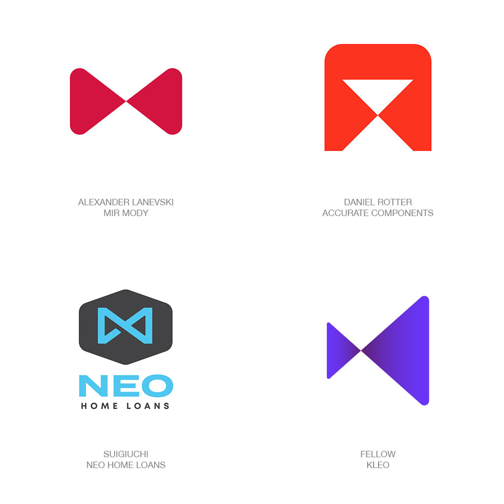
Bass Ale was the first ever registered trademark with its red triangle. A seminal moment for our industry but an oddity in so much as the triangle has always been a bit of an outlier shape for logos.
The shape is hard, sharp, associated with yield and warnings of every pedigree, and only ever stable when parked on its butt. Iconically it is effusively packed with symbolism depending on how you rotate it from play, to up, to down, to spiritual, to change incarnate as a delta. So imagine if you will the stability that occurs when fusing together a pair of these point to point as we’ve seen happen enumerable times over the last year.
From an outline perspective these create the pathway of a rectilinear infinity symbol or a lemniscate if you want to get all proper in terminology. Throw that word into any client conversation to buy a bit more cred. These pairings build a foundation and strong stability and magic happens at the confluence of the two elements. This is where two entities become more powerful, or where one shares its knowledge with others. It’s where optically something is brought into focus and inverted to make it legible. Take special note that horizontally it is a sign of infinite time and vertically it’s an hour glass– your time is near the end. What a difference 90º makes.
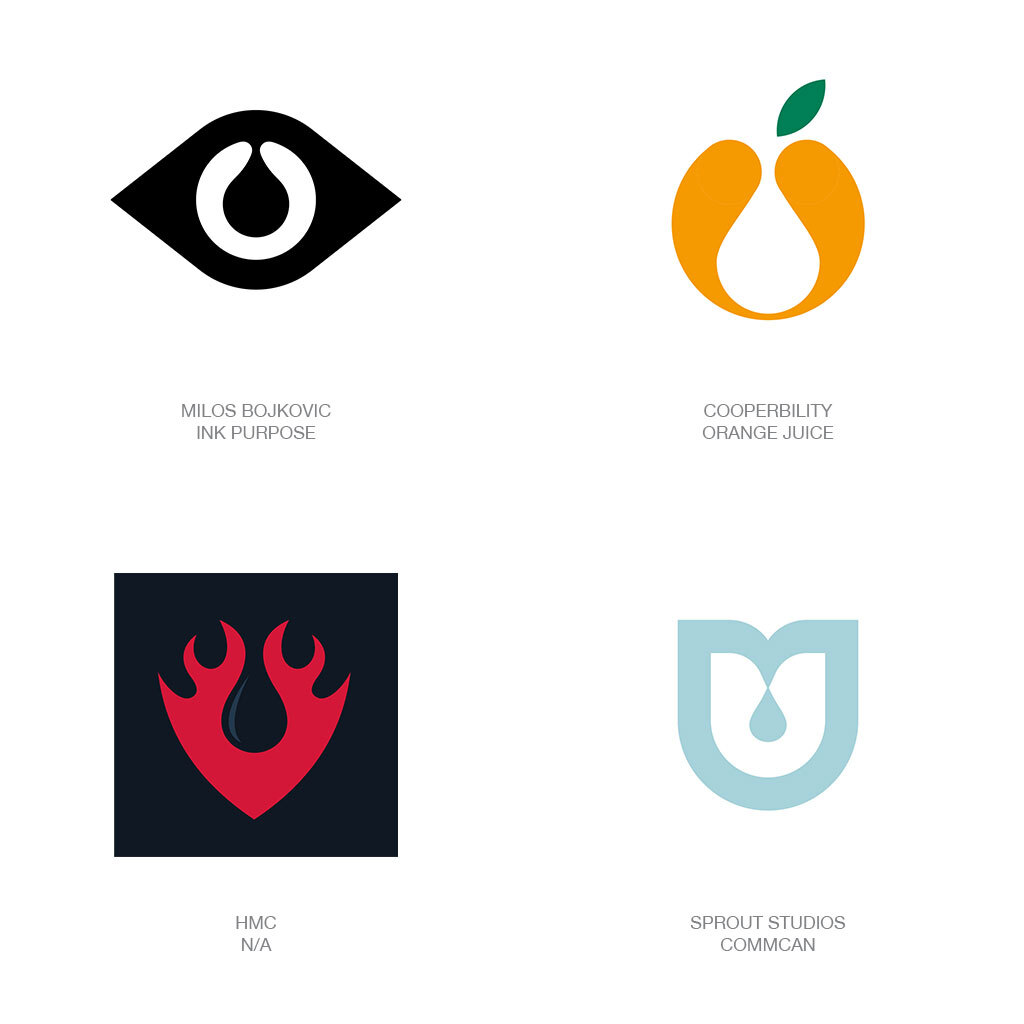
What’s in a drop? A single drop of water… of blood… of oil or vanilla or medicine.
And although it takes 480 drops for one fluid ounce, a child’s tear drop can crush a parent’s heart. All of which show how impactful this trend can be when framed in a proper brand story. There is absolutely nothing new to the use of a drop or two or more in a logo design. It’s one of the quickest ways to indicate liquid or water and more than useful in discussing ecology and our environmental resources. But this report found designers taking a different perspective on the importance of that single drop.
These look every bit the oral inspection and the uvula hanging properly at the back of the throat. Here, drops have been raised to a level of high regard, encased in an informative frame, prepared to provide context to the client’s story. You might also note the drops are still connected to their source as if captured in the act of being precious. Let’s say one is an eyedrop for your contacts or allergies and another looks to be fresh squeezed OJ. And you decide… is one of these drops going to either extinguish or ignite that flame. Be prepared for a reaction as soon as gravity acts and any of these droplets break free.
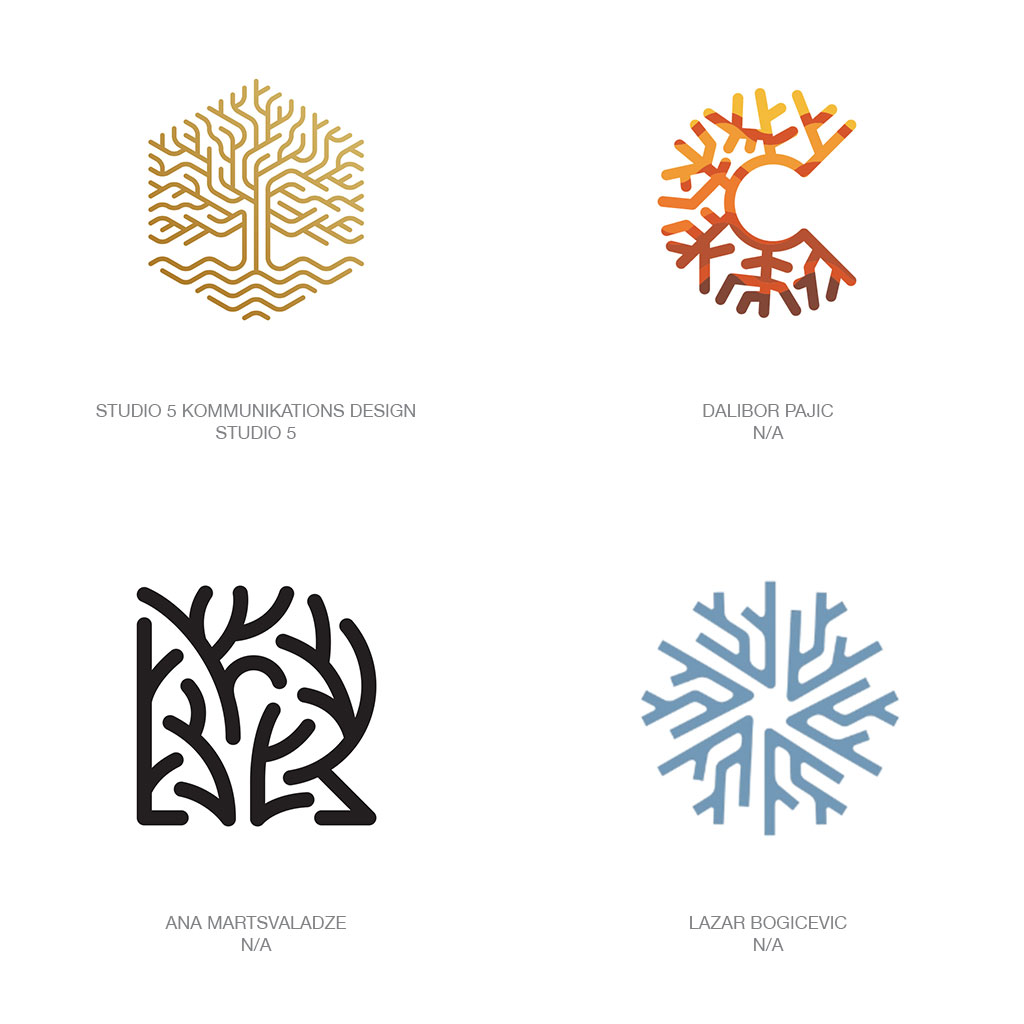
Symbolism is all about taking reality and knocking it down to a representational simplicity.
Trying to iconify the complexity of the roots of a tree can really destroy some brain cells. It’s probably why most designers just turn the tree upside down and call it a day. The inside workings of nature with roots, veins and capillaries or God forbid digital root structures of circuitry can leave a designer curled up in a corner sobbing like a child. Between Fibonacci’s, fractals, and fibrous tectonics, We can see that nature has a plan and it’s here that designers are now starting to break that symbolic code.
Two of these marks have crafted a visual field language that could be referred to as highly organized chaos. By using an angular orthographic grid to chart nature’s course these designs display consistency in angles and spacing as well as avoiding glaring pockets in the pattern’s field. Divergently, the C and R marks take a no less successful tact but are avoiding a formulaic approach to creating that same patch of nature’s lifelines. Each of these marks demonstrate just how insidious nature, or a client might be at making every attempt to capture, maintain, and nurture life. They confirm for us that complex is not a challenge but can be virtuous and productive.
1820, and the world was awash in Didot and Bodoni style fonts with thick verticals and vapor thin horizontals.
That was the way type was meant to be! So when a craftsman at William Caslon’s type foundry created a parody font called Italian and reversed the letter stress, mayhem ensued. Brandishing fat grotesquely engorged horizontals and verticals that were thin spindly pikes, this folly was tantamount to heresy. As it began to illicit favor, enlisted as a display font on posters, other foundries followed suit with their own iterations. A notable editorial referred to these as typographic monstrosities. Spoiler alert… the monster is ALIVE and thriving in this report.
A novelty font at best but that counter distribution of weight turned type into a hedonistic, anti-academic, forbidden pleasure. Don’t look away! With a reinvigorated fan base, variations started to re-percolate from 60’s and 70’s archives and a newly infatuated cadre of type designers. Boiling into the visual brand arena, now it’s a challenge to cross a room without stepping on a wordmark or two with a heavy top and fat bottom. Doubtful these logos will be gracing the conservative c-suites of industry but they have a niche that assures the consumer base, this brand will be your sidekick if you’re looking for a good time.
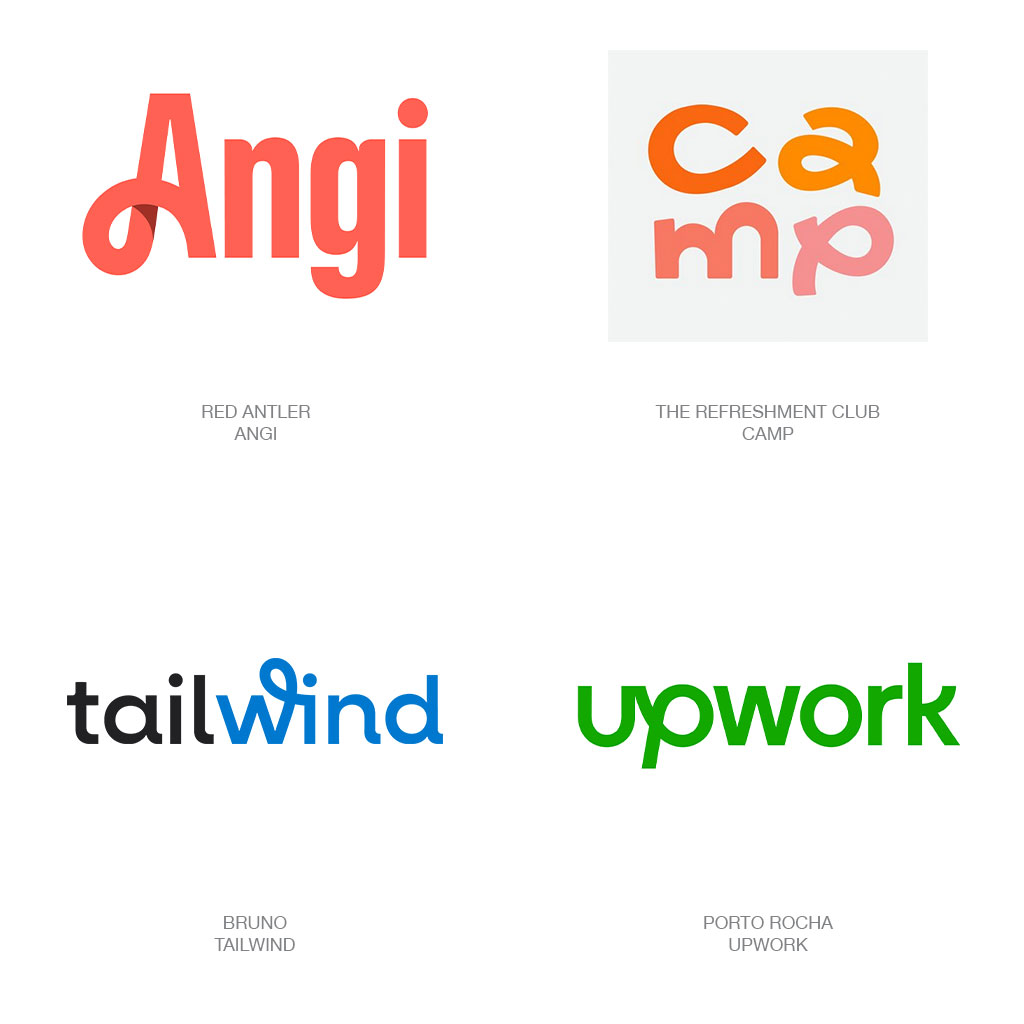
Five years since an avalanche of Spartan sans serif wordmarks lay waste to generations of brand equity, there are brand crafters still cowering in fear as this torrent has yet to subside.
Though the blanding wave led to some stunning visual assets for those that knew what was occurring, many of this ilk fell prey to “me too” as a counter to FOMO. In an ambiguous reaction, this year’s collection of wordmarks are stilted with abundant sans serif solutions to stay on the safe side but with an insertion of whimsy or a visual gesture of self-defiance like a humorless MBA attempting to demonstrate spontaneity.
Note Angi, Upwork, and Tailwind, all determined to demonstrate a freedom of spirit or a human quality by inserting a flowing line of equal monoline weight. All of these succeed but they are merely the tip of the iceberg for scores of logos that embraced one loopy character as the mouthpiece for an otherwise straight up gathering of letters. Yet a few of these free coiling linear characters broke off on their own this year. Whether in monograms paired up with straightlaced wordmarks or the occasional reunion of loopy free spirits like seen in the well-received mark for camp.
The world is changing everyday! Don’t miss the latest trends in Creativity, Marketing and Business! We will bring the whole world to you.
CONTACTS
622 Emporium Tower, 21st Floor, Sukhumvit Rd. Klongton Klongtoey Bangkok 10110
+6626648882
FOLLOW US